Study app design

A Collaborative Study Platform to Empower Self-Studying Students.

A Collaborative Study Platform to Empower Self-Studying Students.

A Collaborative Study Platform to Empower Self-Studying Students.

Project Type

Project Type

Project Type

Personal project

Personal project

Personal project

Deliverables

Deliverables

Deliverables

Responsive Website

Responsive Website

Responsive Website

Duration

Duration

Duration

8 weeks

8 weeks

8 weeks

Tools

Tools

Tools

Adobe XD, Figma

Adobe XD, Figma

Adobe XD, Figma

Main Project Image
Main Project Image
Main Project Image

Problem

Problem

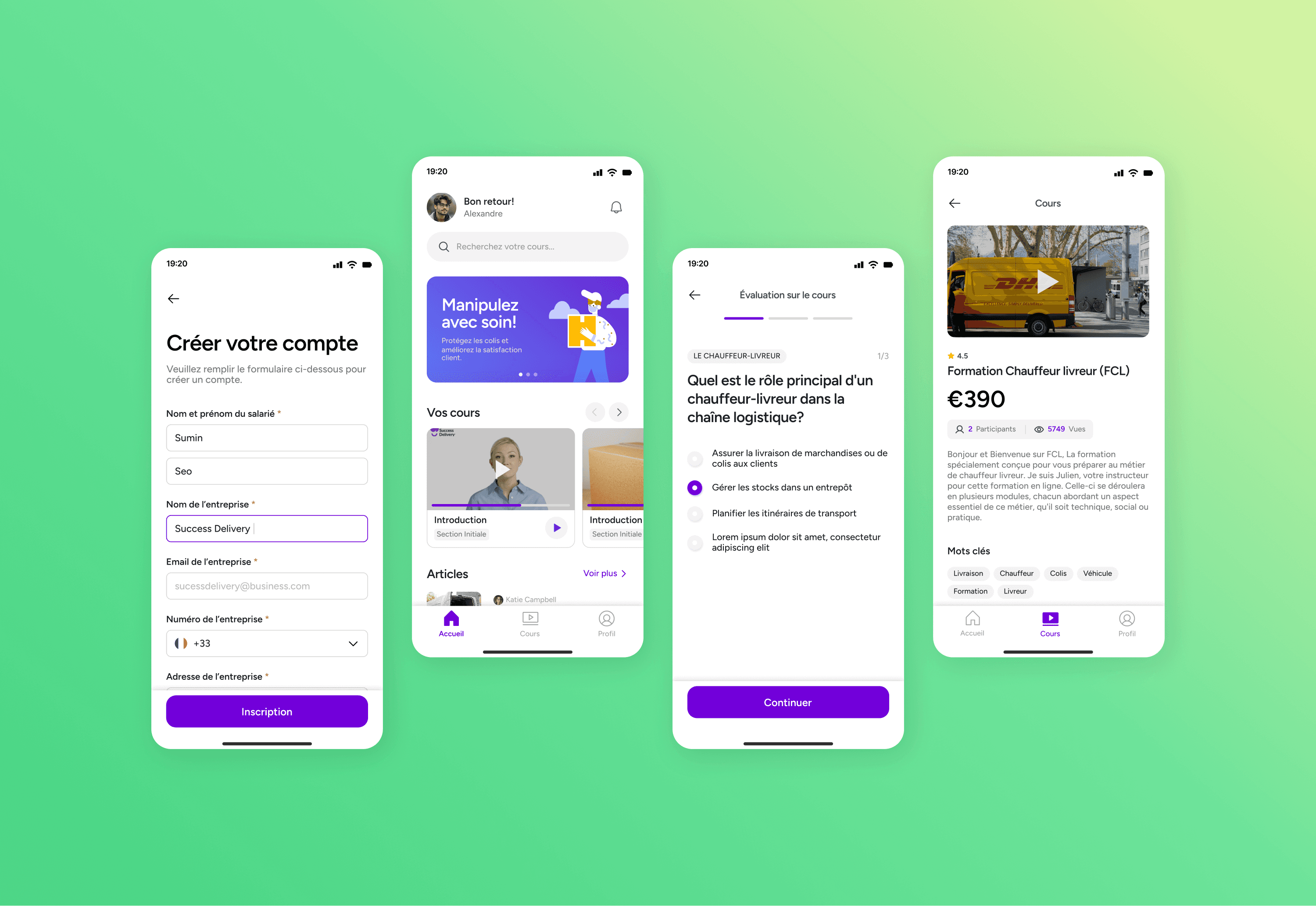
Studying alone can be challenging— especially when it comes to staying motivated, and avoiding procrastination. As a self-taught UX/UI designer, I've experienced these struggles myself, and I wanted to help other self-studying students to effectively reach their goals without giving up. This led me to think:

How can I help self-studying students stay motivated and hold themselves accountable to reach their goal?

How can I help self-studying students stay motivated and hold themselves accountable to reach their goal?

User Interview

User Interview

To better understand our potential users, I interviewed 5 individuals aged 20-28 who are self-studying. The goal was to explore their study habits, planning methods, and challenges they encounter as they study by themselves. As a result, I was able to identify 3 major pain points.

User Journey Map

User Journey Map

Based on interview insights, I developed a user journey map to empathize with users' pain points. This sparked ideas for useful features, such as a task tracker, accountability partners, and an open space for questions and feedback.

User Flow

User Flow

First, I developed user flows for 4 key tasks: connecting with people, joining a study room, posting questions, and creating a to-do task.

Early Designs

Early Designs

Then, I created wireframes to experiment with many, many different layouts. This process helped me identify 5 essential pages to effectively address user pain points: Home, Explore, Connect, Chat, and My Profile.

Sitemap

Sitemap

Design Solutions

Design Solutions

I started designing high-fidelity prototypes by creating the UI style guide and defining the main screens of the app. First, I worked on the desktop version, then added the mobile version, as it's more accessible for students. Inspired by Notion, LinkedIn, and Twitter, the design focuses on features for finding accountability partners and tracking their study journey.

Testing + Iterations

Testing + Iterations

To test the functionality of my prototype, I conducted 2 rounds of usability testing with 8 participants. Based on their feedback, I iterated on my designs multiple times to improve accessibility for both mobile and desktop experiences. Here are the 3 major design improvements I've made :

Final Design

Final Design

Takeaway + Future Steps

Takeaway + Future Steps

WHAT I LEARNED

  1. Planning is key - Creating sitemap and organizing pages + features helped me focus on addressing user pain points and avoid getting sidetracked by less important elements.

  • Planning is everything.

    Creating sitemap and organizing pages + features helped me focus on addressing user pain points and avoid getting sidetracked by less important elements. Also, carefully planning the layouts for different screen sizes saved me a lot of time during design and iterations.


  • Always consider the purpose behind each design decision.

    Besides the interviews and testing, I asked 3 other designer friends to look over my project and they challenged all of my design decisions, making sure there was valid support behind everything. This practice helped me learn to design with more purpose.

  1. Feedback saved my project - In addition to interviews and testing, I had 3 designer friends to look over my project and they challenged all of my design decisions, making sure there was valid support behind everything. This practice helped me learn to design with more purpose.

FUTURE STEPS

  • Customizable Dashboard

    I'd like to make the dashboard more flexible, letting users customize their homepage to fit their unique study styles. This could include options like sticky notes, a stopwatch, motivational quotes, and more.

  • Microinteractions

    I'd like to add more delightful microinteractions to enhance the user’s studying experience and boost engagement.

  • Customizable Homepage

    Allowing users to customize their homepage to cater to their different studying styles. (+ Provide more options such as sticky notes, stopwatch, motivational quotes etc.)


  • Mentorship Program

    Establishing an effective mentorship program that makes it easy for students to find mentors.


  • Microinteractions

    Adding more delightful microinteractions to enhance user experience and engagement.

Copyright © 2024, Designed with love by Sumin Seo

Copyright © 2024, Designed with love by Sumin Seo

Copyright © 2024, Designed with love by Sumin Seo